
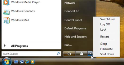
Joel Spolsky writes an interesting perspective about how introducing choices in a software interface can make the UI worse. He uses the example of the new Shutdown UI in Windows Vista, and points out that there are seven states of Shutdown (Switch User, Log Off, Lock, Restart, Sleep, Hibernate, and Shut Down) that are exposed to the user, together with two shortcut icons, at least one of which has indeterminate meaning.
The scary part is that I have been doing software engineering for so long that I would be among the chorus of voices asking for separate Sleep and Hibernate options. The issue of choice vs. simplification is not a trivial distinction. Every engineer and product manager thinks giving more choice to the user is great, and every one of them is saying under his breath, “Because it means I don’t have to guess what the user is really going to do, and therefore I can pass the complexity on to the user.” This is busted behavior.
In defense of the Vista team, and I do (I hope) still have friends there, the implementation pictured here is better than the current implementation in XP, where to Restart, Lock, or Sleep you first press a button on the Start menu labeled Shut Down. But Joel’s point remains: unless you fix the underlying confusion in the user interaction model, cleaning up the menus is like rearranging deck chairs on the Titanic.
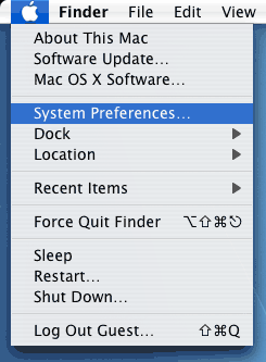
This is one area where the Mac doesn’t do a better job, by the way, but at least all the menu options are easily accessible, and the default sleep/wake behavior is much more intelligently implemented than on a PC. (My MacBook Pro can sleep overnight without a problem, while my Dell will drain its battery if I put it to sleep with a full charge.)
Thanks to the Product Marketing blog for the link.