
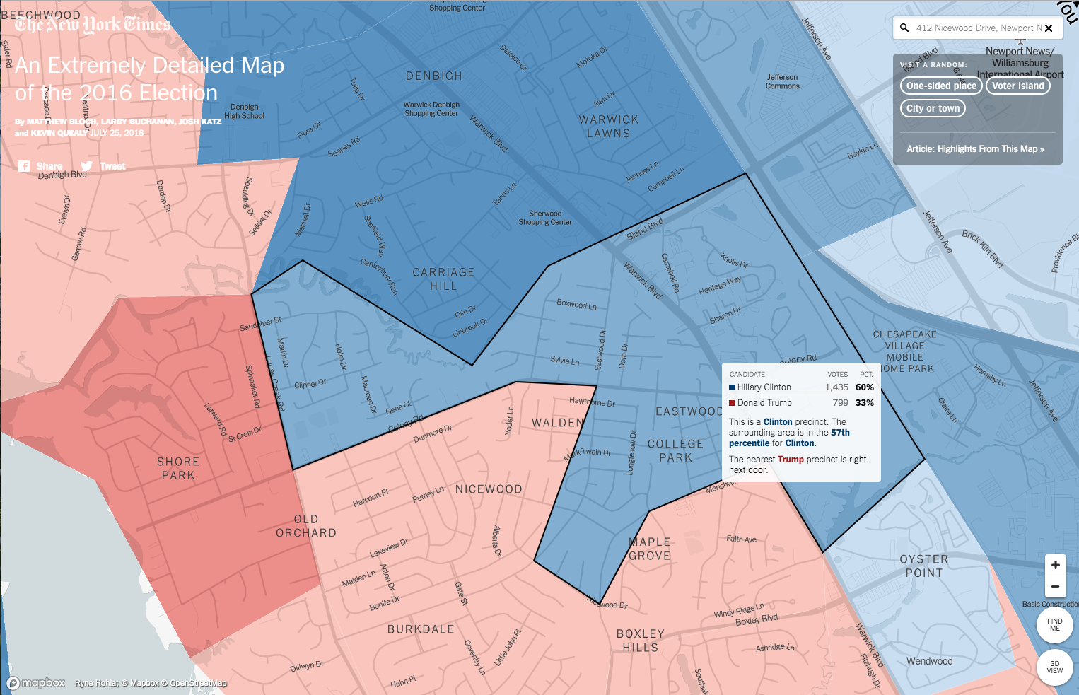
New York Times: An Extremely Detailed Map of the 2016 election. What’s fascinating to me is how transitional some of the maps are—and how well they map to urban/rural, high income/low income, and white/black lines. My old neighborhood growing up went for Hillary at about a 60%-33% margin, less than neighboring streets that are (or were 20 years ago) home to lower income housing, but much more than some of the other areas of our suburbs.
My current house is in the middle of a big blue bubble, of course.