Hello to my 10 subscribers

Dave has been steadily rolling out new features in his OPML aggregation site, feeds.scripting.com, including:

If you’re not already participating in this community, and you use an aggregator, go, go, join. It’s getting cooler every day.

The past, in living color

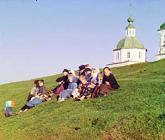
russian children on hill 1909
Lisa and I watched a special on the Library of Congress last night on PBS and were blown away by one of the exhibits, a selection of color photos from Tsarist Russia.

Yeah, you read that right. I was blown away, so made my way back over to the LOC website for more info, and found the exhibit, called “The Empire That Was Russia: The Prokudin-Gorskii Photographic Record Recreated.” The Tsar’s photographer, Sergei Mikhailovich Prokudin-Gorskii, invented a camera that took three black and white plates through red, green, and blue filters of the same scene; he would then project the images through colored filters for color images in a magic lantern show. The LOC has taken the plates and recreated the process digitally, applying additional corrections such as careful re-registration and color correction, to yield glorious full color recreations of Prokudin-Gorskii’s photos, which document the extent of Tsar Nicholas’s empire on the eve of revolution.
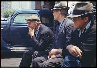
new york bowery bums 1941

In looking to see who else had written about this exhibition (which is, after all, not news), I found another treasure trove of early color photos, the Charles W. Cushman Photograph Collection at Indiana University. Cushman, a gifted and dedicated amateur photographer who embraced Kodachrome film as early as 1938, two years after its introduction, left an archive of more than 14,000 color slides taken between 1938 and 1969 across the US and other countries. The image quality is outstanding, the indexing superb, and the sense of dislocation even more intense than with Prokudin-Gorskii’s photos. As the introduction to the collection points out, most of us don’t have a “true color” sense of the time before about 1950. Seeing color images of Faneuil Hall before the elevated highway was raised, for instance, is mind-boggling. But Cushman looks beyond buildings, capturing, for instance, a wedding in Boston’s North End, carriage horses feeding in the Piazza Ognis in Florence, the old fruit and vegetable market at Covent Garden in London, children on an old dirt road with flowers in Fairfax County near Dranesville (what is now the northern part of McLean), the Grand Coulee Dam under construction, and many others.

Jarrett House North, now automatically Print Friendly

I have, I think, put the finishing touches on another element of the new design for this website: the print stylesheet. One of the things I wanted to do when I first transitioned this site to a CSS based design was to optimize the print experience as well as the online experience. CSS, through using stylesheets linked for media="print", allows you to specify alternate presentations of your pages for print purposes without having to change your underlying HTML or forcing the user to choose a “print friendly” view.

The print stylesheet for Jarrett House North now suppresses all the navigation elements, gives a reduced size version of the site logo, and (on browsers that support it, such as Gecko-based browsers and Safari) prints the full hyperlink as text next to each link. Give it a whirl—I think you’ll like it.

For now, the regular print-friendly link will remain on every page, for print-friendliness on browsers that don’t offer full CSS compliance. But you no longer have to do anything special to get that print friendly feeling.

One interesting implementation thing I learned in the process. I couldn’t figure out how to dynamically resize the banner image and provide alternate text that I didn’t show in the main template, so I created a DIV that is hidden by the default stylesheet (by setting display: none;) and shown in the print stylesheet. Or at least, that was the intention; the first few times I made the change, the print version of the banner never showed up. I finally figured out that the default stylesheet’s rules are applied to the print content, then overridden by the print stylesheet’s rules. So rather than just redefining the div, I had to actually specifically override the display property by setting display: inline;. Once I did that, I was golden.

The main resource I used in creating the print stylesheet was an article by Eric Meyer at A List Apart called CSS Design: Going to Print.

Snow-stalgia

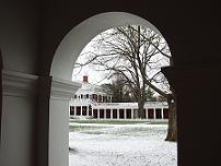
snow at uva from pav vii arcade
I was overwhelmed with a bit of nostalgia for my undergrad days today and decided to go hunting for pictures. I found David Evans’ site and was blown away. Evans, who is on the Computer Science faculty at the University (and an MIT grad), has hundreds of photos on his site, including many astonishing (and astonishingly big) ones of the University grounds. One of Evans’s photos of the Rotunda in snow is currently adorning my desktop; credit where due.

Morning coffee notes

A few quick ones. I’m working from home this morning, waiting for the slick ice on our hill to melt enough so that I don’t kill someone trying to go down to the office. I may have to leave anyway, though, as the power has flickered here more than once already.

Real HRs and faking them properly

I finally got around to putting in proper HRs in my CSS and in the sidebar. The redesign uses a fleuron from the Cronos font (in which the other fleurons and my page title are set) where a horizontal rule would normally go. Of course, this looks pretty silly in Lynx. So I turned to Dive Into Accessibility to see how HRs should be “faked” using CSS. It turns out to be a pretty simple trick involving background images and HR display rules, though of course there are some hacks required to get properly degraded behavior in downlevel browsers. Anyway, the point is, it worked. You may need to refresh the page to get the updated stylesheet to load properly, but once you do, you’ll see the fleurons and downlevel and text browsers will see horizontal rules.

Snow? In Seattle? Quick, start a blog!

I just got a reminder that the amount of snow that has fallen is never the issue; it’s how the infrastructure deals with it. In the case of the Seattle suburbs, that would be: not well at all. We’ve only had a few inches of snow here, but there are no snowplows, no sand trucks, no salt spreaders, nothing. I made the mistake of leaving my laptop at the office, so I had to go in and fetch it—and see the madness first hand.

I think I’ll get out of here before things get too much worse.

In the meantime, I found this Snow Storm Blog at the Seattle Times pretty amusing.

Mind blown, courtesy the Guardian

Looks like I’m about to be published in another international newspaper. This time it’s the Guardian, who are doing a piece about the phoneblog exhibition I pointed to a while back. I’ll put the pointer up as soon as I see the article.

Just a side note: this is definitely another case where my participation in the blogosphere—by which I mean blogging, photoblogging, and reading other sites—has led me in some unexpected directions.

RSS luv

Two quickies and then I must sleep:

  1. RSS feed (scraped) for news updates from the Mars Rover landing. Subscribed, as Dave would say.
  2. I’m looking at the new feed: URL proposal. While I understand the technical arguments that a lot of folks are making—that this should be a MIME type, not a URL type, since the feeds are still fetched by HTTP, I can’t argue with the end result. One click subscriptions are the one feature I really missed after I migrated from reading RSS in Radio to other aggregators, and now it looks like there’s an emerging cross client consensus on how to make the feature work everywhere—for instance, in NetNewsWire. Right on.

Trackback and validation, and CMSes, and …

Scoble says that the Radio trackback feature (which is implemented identically to the Manila implementation on this site) makes his site fail validation. Frustrating when a useful feature like that has to be turned off, but I understand the pain; I’ve been working on validation myself.

At this point there are still a bunch of errors reported by the W3C’s validator, none of which I can do anything about. They all have to do with ampersands in URLs in my articles. Ampersands are commonly used in URLs when there are multiple arguments. Manila thinks that those ampersands should be represented by actual & characters (and enforces this in its managed content), while the W3C validator insists that, at least for HTML 4.01 Transitional, the ampersands must be represented as &, even in URLs. So there’s nothing I can do; the site is as valid as it’s going to get.

(Incidentally, if anyone has Manila spitting out valid XHTML, I’d love to know. It would be nice to get off HTML 4.01.)

For more info about CMSes and HTML validation, there’s a great interview with What Do I Know’s Todd Dominey over at WebStandards.org.

First ski of 2004

Lisa and I went back to Snoqualmie today for another half day ski. The difference is that we had our own boots and brought our rented skis with us, both courtesy REI. We are definitely getting into skiing as a serious lifestyle, and we figured ski boots were the right place to start investing in gear. Man, were we right. My feet feel so much better than they ever have after skiing.

The skis were a mixed blessing. On the plus side, we paid $10 less per pair than we would have at the mountain, and didn’t have to deal with the line (which cost us almost an hour on Monday). On the minus side, the skis were crappy. I don’t know if all Rossignols are bad, or just the ones we’ve rented. But then we did rent them on Saturday.

And, oh my goodness, it was freezing up there. Icy road conditions from Issaquah all the way to the summit, and about 7° F on the slopes. (Fortunately it warmed up. A little.) But good skiing, even a little fresh powder on the slopes, which for Snoqualmie is really saying something.