Over the weekend I did some curation of the Virginia Glee Club history wiki, pulling together some previously posted images into new categories and scanning a few large format posters. You can now see all the posters and program covers that we’ve scanned in one place.
Looking at all of them in order, I’m reminded of my own role in the evolution of the graphic look of the Glee Club as expressed through its posters, programs, and tape jacket covers. From about late 1991 through late 1993/early 1994, I was either the “typesetter” (aka Quark Xpress jockey) or designer of all the Glee Club’s printed matter, and it’s interesting now to remember that we really had a firm (if amateur) idea about the direction in which we were going, graphically speaking. And looking at it in the context of what came before, it’s interesting just how different that direction was from what the Glee Club’s visual identity had been before.
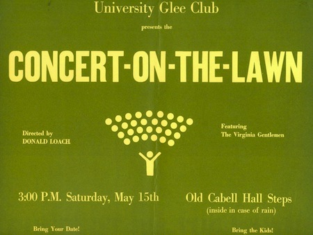
 I think it’s fair to say that, based on the evidence that has survived, that there was really no distinctive graphic identity for the Glee Club prior to the mid-1960s. While it’s hard to say for sure–posters and other large printed ephemera are rarer in the historian’s archives than programs–all the printed matter I have before 1965 is simple, generally typeset, and consistent, probably in a University “house” style. This started to change once Donald Loach took over leadership of the group. As early as Christmas 1965, and maybe earlier, the glyph to the right started to appear on Glee Club printed matter. Designed in the International style, the icon was clear and recognizable, and put a new graphic element into the Club’s printed materials. The “Y conductor” icon appears often through the 1960s and 1970s, most strikingly as the central design element in the poster for the 1971 Concert on the Lawn. But it was not used consistently, and in fact by the mid-1970s had largely disappeared in favor of more visual graphic elements intended to reinforce the theme of each individual concert: woodcuts for concerts of medieval and Renaissance music, sheet music for a concert of Viennese works, silhouettes of Jefferson and images of the Lawn for University functions.
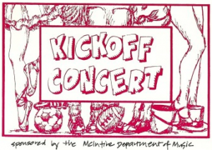 By the 1980s, a more hand drawn style had begun to emerge. The iconic Christmas wreath, as shown on the cover of the Christmas program from 1982, is colorful, hand drawn, and generally less formal than the 1970s programs. The Kickoff Concert cover from 1988 is even less formal, looking sketchy and even cartoony. Both of these designs would persist into the early 1990s, and both were around when I began as “computer dude” for the Club in the fall of 1991. While I didn’t save the posters or programs, I remember this design for the Kickoff Concert being in use in both 1990 and 1991, and certainly the Christmas wreath stayed throughout this period.
![]()
When John Liepold came on board as a fresh new conductor in 1991, he took a hands on approach with the design of programs, letterhead, and other printed matter. He probably was the designer of the distinctive Virginia Glee Club letterhead–Palatino bold, with the word “the” in small caps, a thick rule beneath, always either black on white or white on black–and its use and design was the one consistent rule graphically during those years, along with the use of Palatino as the standard font. The intention was to be more visually bold and to get our name out more, and–given the limited typographic palette available in 1991 even on a Macintosh–I think it was pretty successful.
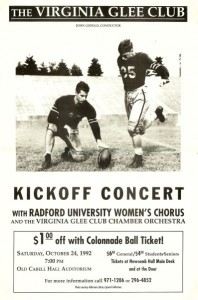 My contribution, other than general typographic contributions, was to add more photographic and representational imagery to the mix. Some of the posters I produced were simple retreads of designs that were already in use when I came on board (the Finals Concert poster is in this camp) but others were complete redesigns. The Kickoff Concert, which was my first poster the year I was vice president, was my first target, and I decided to go with an image from the archives that would be visually bold, memorable, and tied into the history of the University. That I happened to see this photo in the Special Collections archives a few months after seeing this poster for the first time was a happy graphical accident. We used it again in 1993 but I don’t think the poster reappeared since then. But the basic themes–striking imagery, ties to the history of the University to reinforce our claim as the oldest musical group on Grounds, fun–were to appear again in other posters. (I wrote about this poster once before a few years ago.)
The other major redesign I presided over was the Christmas concert. Wanting to freshen the wreath, I asked Craig Fennell to help me design a replacement, and he obliged with the “quarter-wreath” treatment we used on the 1992 and 1993 Christmas concert materials. I think this design was less punchy than some of the other posters we did, but the overall effect was still good.
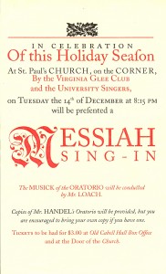 The other contribution I made was the “letterpress homage poster”–posters that mimicked presentation forms and styles from the letterpress era. Inspired by an English playbill poster that had been recreated in the Colonial Williamsburg printing office with honest to goodness movable type, I designed three posters in this style: a poster for the joint U Singers/Glee Club Messiah Sing-In in the style of an 18th century English playbill, a Lawn Concert flier in the style of a 19th century advertisement, and the poster for the Spring Concert in 1994. Of the three, the Messiah one is probably my favorite as graphic art–clean, dramatic, colorful, and correct use of the long “s”–but the Lawn Concert flier was probably the most effective at getting bodies to the show. Something about the little Porte Crayon student seems to strike a chord with viewers even today.
I’m sadly short on examples of work after I left–hope to scan some this weekend–though I would be remiss if I didn’t point out that Craig Fennell, Matt Vanderzalm, and others kept the artistic streak of our poster work alive through at least the late part of the 1990s.
