-
Why are the Pioneer probes so far off course?
-
How a bunch of Valley people thinking like social network builders made Obama a fundraising force to be reckoned with.
-
The font game just got a lot harder.
-
Bush once again proves he’s a uniter, not a divider. He’s doing a great job of uniting the Democrats.
-
Hmm. The Pops and Death Cab? The Pops and Belle & Sebastian? Hey, it could happen. I’m still holding out for that call to be backing vox for an EdgeFest show. I’d go in a second.
-
Interesting perspectives. I don’t think Sloan is the only school to bank on growing non-MBA programming, though–think Darden’s executive ed.
-
Hilarious.
Day: May 16, 2008
About today’s theme: Cutline
 I swear I’ll stop writing about the site soon, but right now the visual aspects are kind of front and center in my mind. Today’s theme is called Cutline, and it’s by Chris Pearson. It’s a very popular theme, currently number one at the WordPress themes site.
Things I like about it:
- Appearance: crisp, graphically well laid out, doesn’t use the Microsoft sans serifs (though I’m not crazy about Arial/Helvetica as they ship, and will probably make some tweaks here).
- Post layout: brings the interaction element right up top.
- Easy to manage.
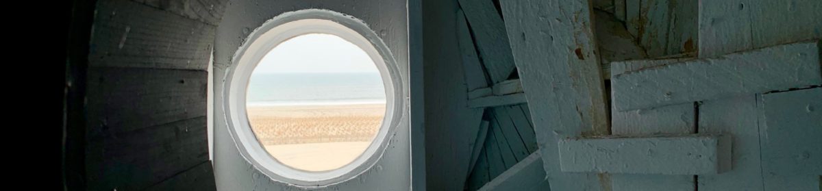
- The headline image has interesting placement, the author has provided an easy way to randomize the headers, and the non-obvious image dimensions have made me think about how to pull details out of larger photos.
Things I don’t like:
- The typographic color is all off. The posts disappear in the middle of the page because the sidebars are so dark. Partly this is because of…
- The heavy use of horizontal rules as separators. The dark lines pull my eyes all over the place. And the bold Helvetica/Arial for the headline type in the sidebar is overkill.
- The title region plus the header image pushes the site pretty far down the page.
- Not liquid layout. I appreciate the fact that I don’t have to cram everything into one sidebar, but it makes the page harder to work from an information perspective, and it limits the resizing I can do. Plus the sidebars are sized in pixels, so that limits the amount of text resizing I can do.
I can fix #1 and 2, and have some ideas about #3, but #4 is something I’d rather not try to fix myself. I’ll have to see how other themes handle this issue.
Anyone have strong thoughts about this theme?